Generative AI is capable of producing a wide range of outputs, from texts and images to videos. However, the quality of the results largely depends on you. Here’s what you should keep in mind when writing prompts.
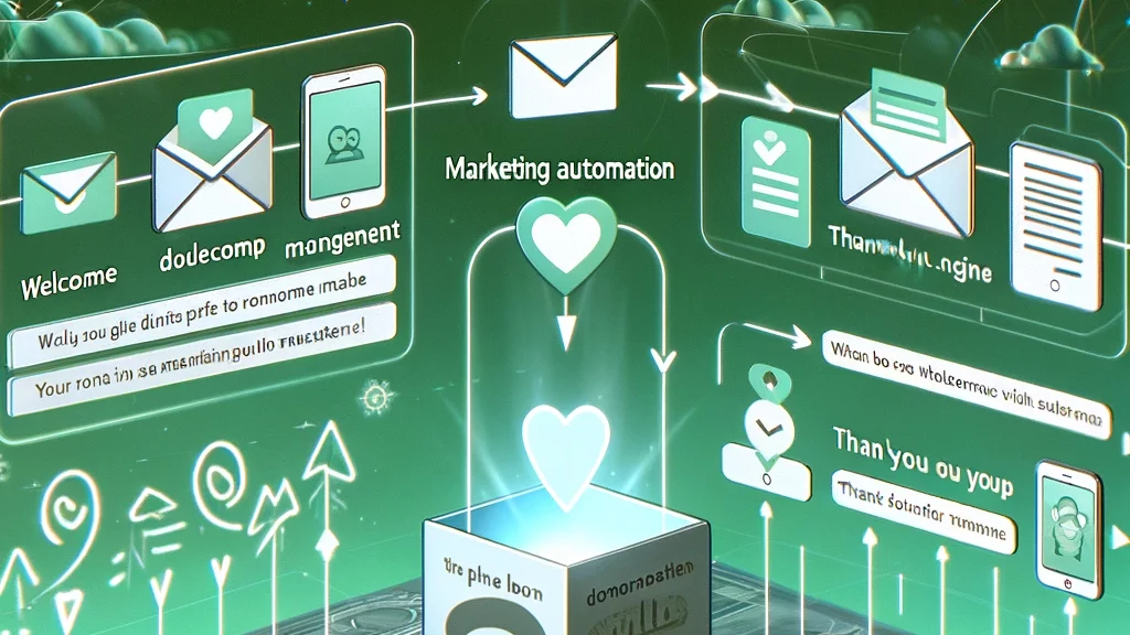
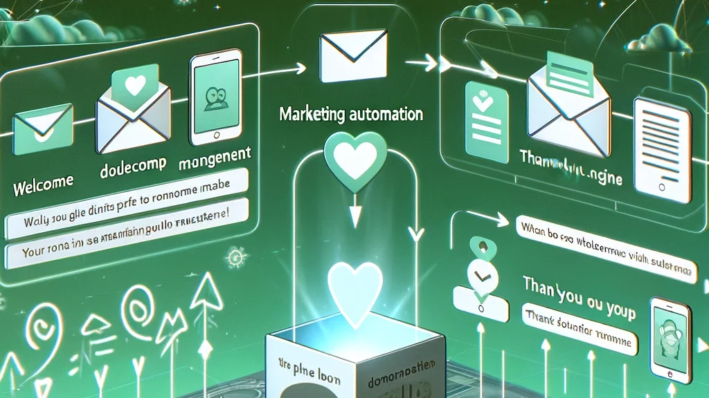
Do you want to introduce marketing automation in your NGO but don’t know how? We will help you with the first journeys, providing both know-how and technology.
The donation page of a non-profit’s website is like the end of the first page of a book—it determines whether the donor wants to “read on” and embark on a journey with the organization. The crucial moment is when the donor clicks the “Donate Now” button. Conversion rate, the percentage of visitors who complete a donation, is key. Drawing from our extensive experience, we’ve compiled essential tips to sustainably increase your online donation volume and improve your donation page’s effectiveness.
The surroundings create the atmosphere
Imagine inviting your date over for dinner. You create an impressive 5-course meal, but your dining table is sticky, dirty laundry is piled up in the corner, and the radio is blasting ear-piercing squeaks. Not very promising, is it?
The same goes for your donation form. The most beautiful form will not be used if the surrounding page is sloppy, confusing, and simply unattractive. Therefore, be sure to follow these tips when designing your donation page:
1. Consistent Design
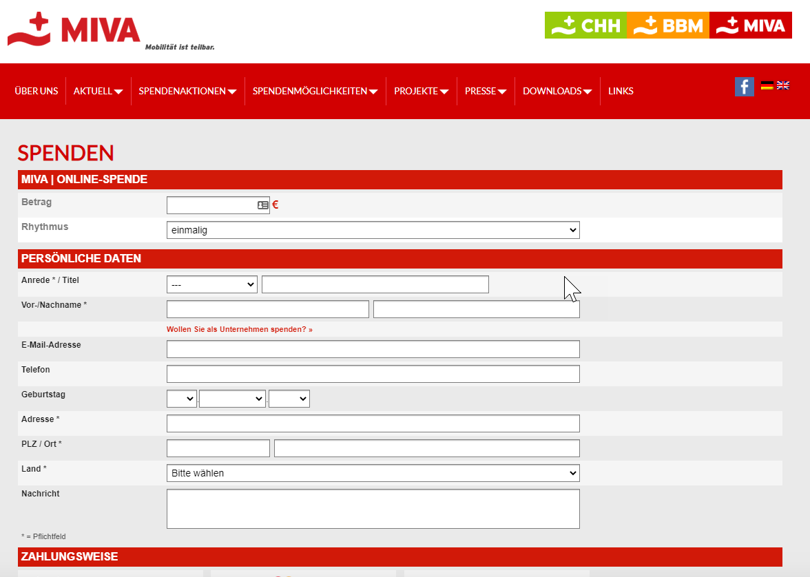
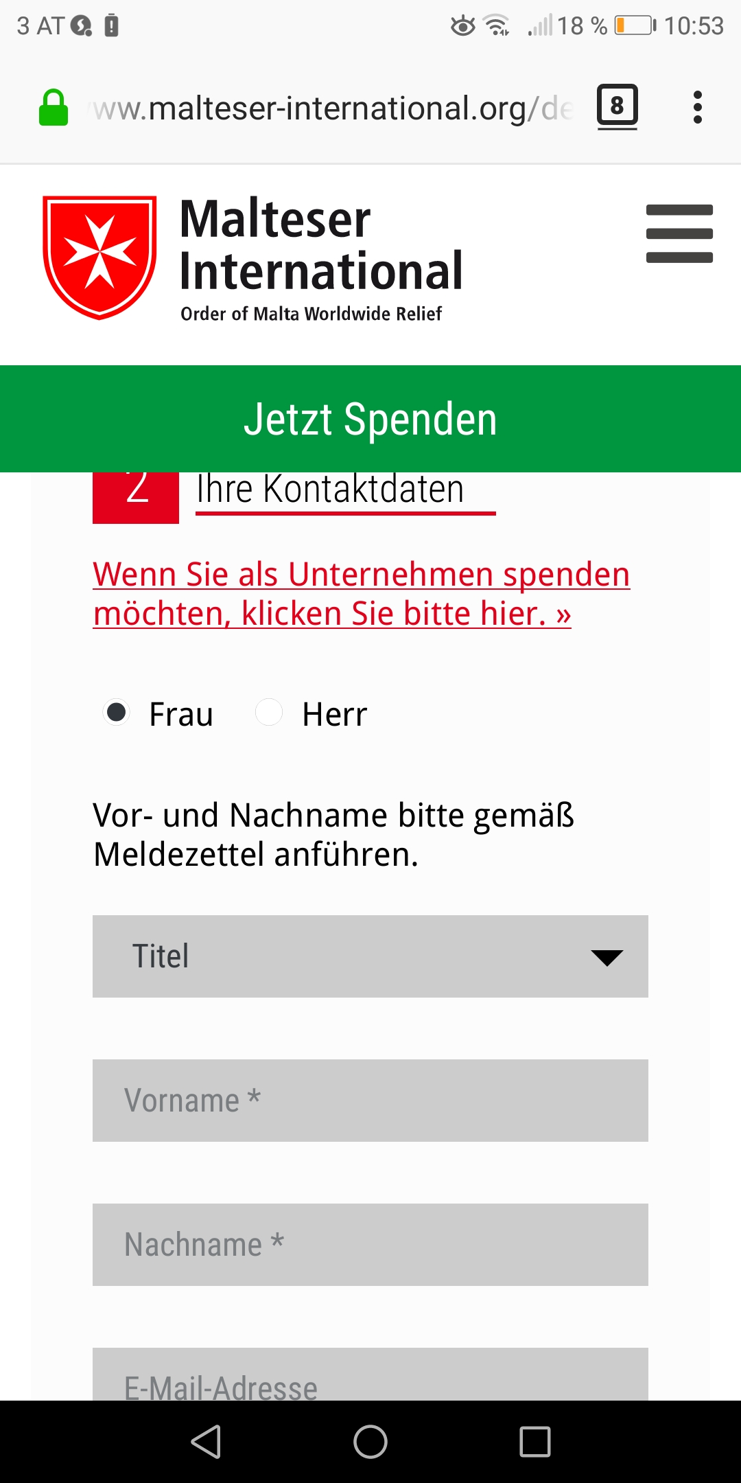
Design the donation form page in the same style as the other pages on your website. Your logo should be prominently displayed – preferably at the top of the page. This enhances the recognition value of your organization and builds trust. After all, your donors are entering personal information there!
At MIVA Austria, the donation page shines with a consistent design.
2. Security
Following up on this topic: Make your website secure! Data entered on https websites is encrypted, protecting it from unauthorized access by hackers. If your donation page begins with “https://”, it builds trust with the donor, and you can fundraise digitally in a professional and secure manner. For more information, you can check here, but when in doubt, simply ask your trusted IT specialist or your provider.
3. Focus
Ensure there is minimal distraction from the main goal! This means designing the page clearly and unambiguously. Many non-profits, for example, do not include a menu on the donation page and do not link to other pages from there. This minimizes the risk of potential donors getting distracted by something else and leaving the page.
4. Provide Reasons
Be sparing with text on the donation page, but clearly and explicitly tell visitors why they should donate to you right now. State the most important reasons concisely – preferably as bullet points. Distill everything you want to say about yourself and your mission into the key arguments for donating.
Numerous A/B tests have concluded that a friendly face is one of the most important elements in convincing users, even on the internet. Therefore, include a professional, approachable photo of a contact person – for example, a donation service staff member – on your donation page. Don’t forget to also provide the name and contact details of the person!
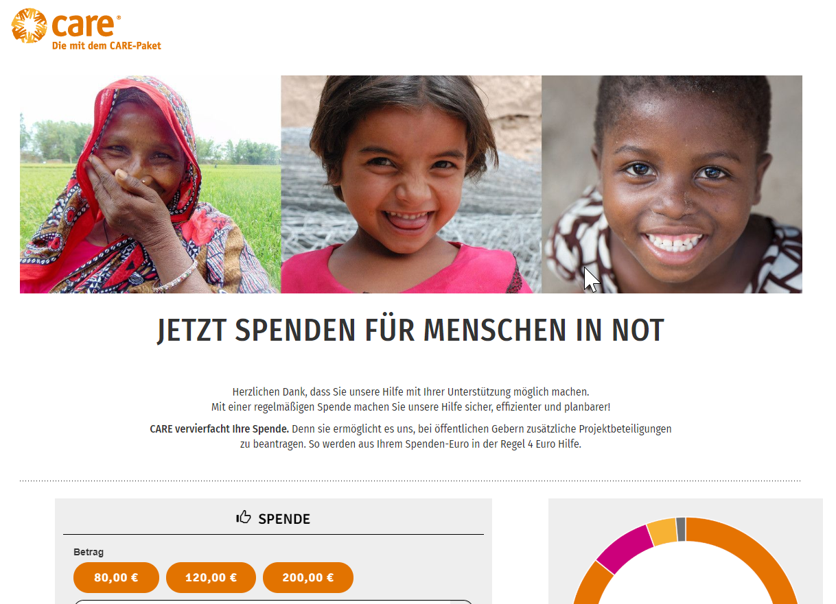
Use emotional images. However, make sure that the images you use are of good quality. They should underscore the necessity of the donation but also have a positive impact. Images of cruelly killed animals or severely ill children, while reflecting a sad reality, can be very off-putting. Try to find images that highlight the positive aspects of your work!
Care knows the power of positive images and automatically suggests high contributions.
The Heart of the Matter: Tips for Designing Donation Forms
To stay with the metaphor: the date won’t go well the other way around either. Please don’t serve canned chili at a romantic candlelight dinner! Once the right atmosphere is set, prepare your convincing gourmet menu: a clear and easy-to-fill donation form. With these tips, nothing can go wrong:
1. KISS Your Donor
You’ve probably heard it before: Keep it short and simple (KISS)! In our experience, this is the most important and valuable tip for designing donation forms. Internet users are fickle and have little patience and even less time. Experience shows that the more complicated and lengthy the form, the more donors drop off. Your donation form must be quick and easy to fill out. Here’s how you achieve that:
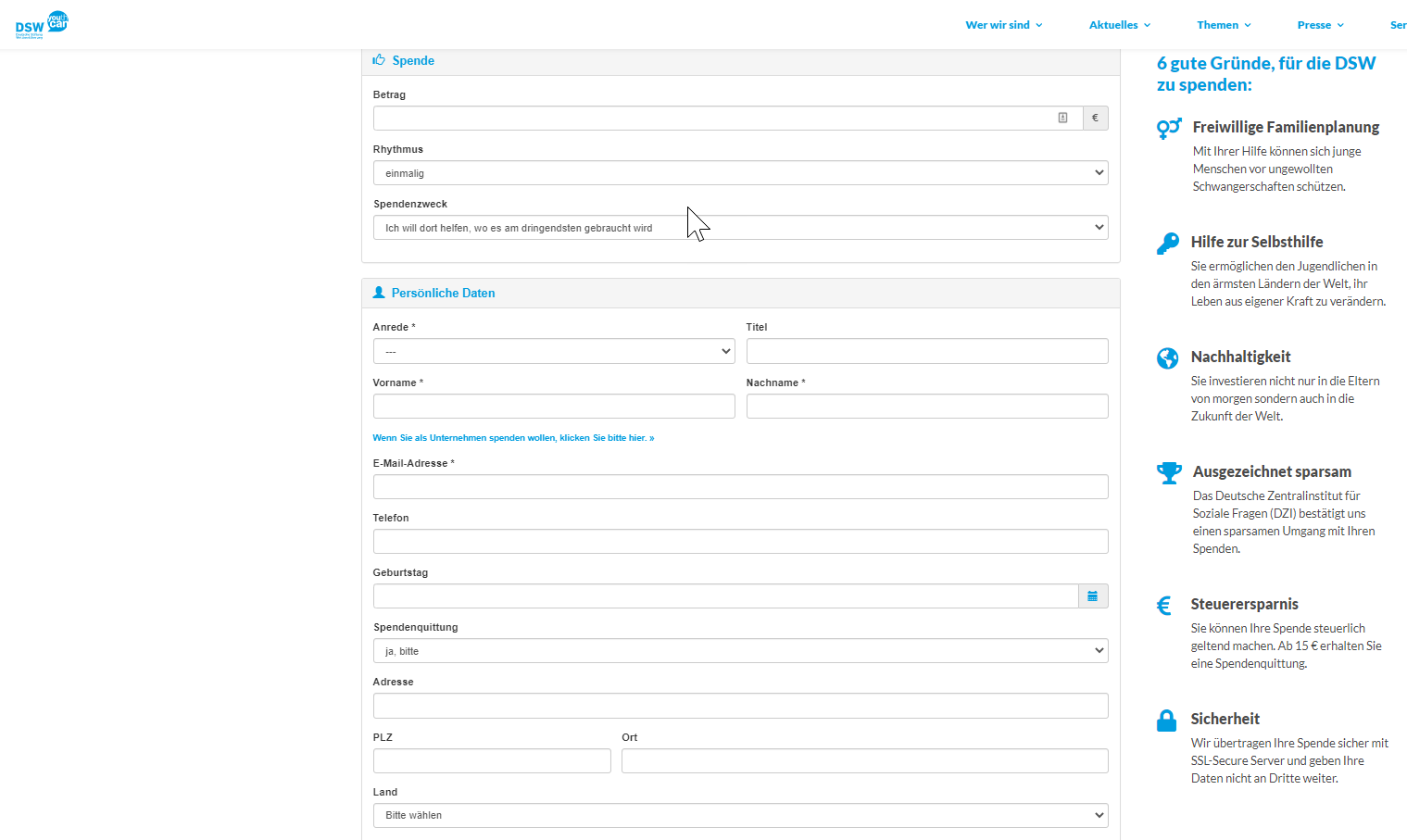
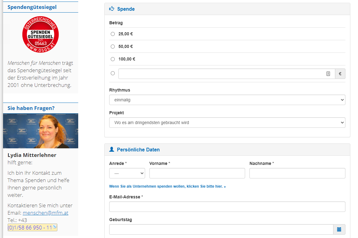
Keep the number of required fields as low as possible. Do you really need every donor’s postal address? Do you need every supporter’s birthday or phone number? Reduce to the essentials – a donation form is not a survey.
Use forms that enable intelligent fields (e.g., from FundraisingBox). This way, you can, for instance, only ask for the postal address if the donor wants a donation receipt or the membership magazine.
Optimize your form for mobile use. Nothing is more annoying than having to type novels on a small touchscreen. There are solutions that allow hiding individual fields on mobile devices (yes, also from FundraisingBox 😉).
Describe as briefly and precisely as possible what the donor should enter in each field. This avoids confusion and incorrect data.
Focus on monthly donations. According to the 2020 Global Trends in Giving Report, 45% of online donors give on a monthly basis. This is also very beneficial for non-profits, as it ensures a predictable and regular amount coming into the account. Overall, these donors contribute a significantly higher amount over their “donor lifetime” than one-time donors. Even compared to annual contributions, monthly donations fare much better: the annual amount from monthly donations is almost four times higher than with an annual rhythm. So, how do you convince your donation page visitors to donate monthly?
Develop and promote a special program for monthly donations and use a dedicated form that only offers this option. This can be for sponsorships or specific projects, for example.
Always and exclusively ask for a monthly contribution and explain why this helps you much more than a one-time donation. Convincing reasons can be, for example: better project planning, more stability in financing, etc.
If you have only one donation form available or do not want to create separate forms, set the form so that the monthly payment option is pre-selected.
SOS Kinderdorf has a dedicated sponsorship form for regular donations. A monthly amount of €30 is pre-filled automatically.
It also looks great on mobile devices!
3. Single-Step Forms
Avoid multi-step forms. While they might look neater and more organized, tests have shown that the conversion rate is lower compared to single-step forms. This could be because potential donors can see the entire process upfront with single-step forms. They can better estimate the effort and time required to fill it out, making them more likely to proceed. Additionally, poor internet connections can lead to long loading times, significantly prolonging the donation process.
4. Make Suggestions
Provide contribution suggestions and don’t be too modest. People like having a reference point for their decisions and often go with what others do. Additionally, they tend to choose the middle option. We recommend an odd number of contribution suggestions around the target amount (e.g., €30 – €50 – €100 or €15 – €50 – €80 – €100 – €130). Also, give your donors the option to choose their own contribution. The higher the suggestions, the higher the selected contribution is likely to be.
Whenever possible, use multiple forms. This way, you can create tailored donation pages according to the channel, target audience, project, etc.
6. Provide Options
Offer all available payment methods for both one-time and recurring donations. The more options you provide, the lower the risk that potential donors will drop out because their preferred payment method is not available.
Customize the submit button to align with your mission. Giving the donor a message when they complete their donation increases their satisfaction and leaves a lasting impression. Instead of a plain “Complete Donation,” choose words like: “Yes, I want to contribute to the environment.”
8. The Page After
Pay special attention to the confirmation page. This is the page the donor sees after completing their donation. You don’t want to give the impression that you are only interested in their money. Say “THANK YOU” and offer the donor your hand for the journey you’ve now begun together. Be creative here! For inspiration, here are a few suggestions:
– Fill the thank-you page with additional information (e.g., the current annual report for download, links to project pages).
– Give your donor a token of appreciation (e.g., a virtual thank-you card or a great background image for download).
– Produce a thank-you video with your staff that the donor can watch on the confirmation page.
– Ask the donor to follow you on social media and integrate corresponding buttons.
– Refer to your events page and invite them to attend.
– Encourage them to create their own fundraising campaign.
– Ask the donor to share their commitment with their network and motivate others to donate (e.g., via email or social media).
9. What Happens Next…
Set up automatic thank-you emails. This allows you to emphasize how important the donation is to your mission and explain in more detail what you will do with the donation. Here, you can also encourage further engagement or give away goodies. If you use FundraisingBox, you can personalize these automatic emails (e.g., personal greeting with name, confirmation of donation amount, payment interval, and payment method, etc.). Include all contact options so the donor can quickly and easily reach out if they need anything.
10. Check – Double-Check – Recheck
Test, test, test! Once you have set up your donation page, form, and confirmation page, be sure to test everything thoroughly. Make a donation yourself and carefully go through the entire process:
– Are the form fields clearly labeled? Are they logical and necessary?
– Is there anything on the page that distracts you from donating?
– Is the confirmation page friendly, informative, and emotional? Does it invite further action?
– Do you receive a personalized thank-you email promptly with contact details for any queries?
Also, test the entire donation process on a mobile phone and tablet!
Have someone who was not involved in the creation and design test the entire donation process. This could be a family member or a friend. An “outside view” is often invaluable!
More Tips for Increasing Donation Volume
While these were already many tips and suggestions, we have even more in store for those who do not want to miss any optimization opportunities for their donation form:
Never underestimate the donation button. It is the gateway to your donation page, so it should be very prominent and noticeable everywhere on your website. Internet users are used to finding important information at the top of the page – ideally directly in the menu, preferably on the far right. Design it in a color that stands out from the rest of the page. Signal colors like red, orange, or yellow are suitable. It should lead directly to the donation page. Do not place any project pages, text pages, or image pages in between!
…which also stands out immediately in the mobile version.
2. Have you heard of the Call to Action (C2A)? These are direct prompts to take a specific action. Implement this opportunity on your project pages. Integrate a Call to Action in your newsletters, social media postings — basically everywhere it fits. With a “speaking” button, your users will immediately access the donation page.
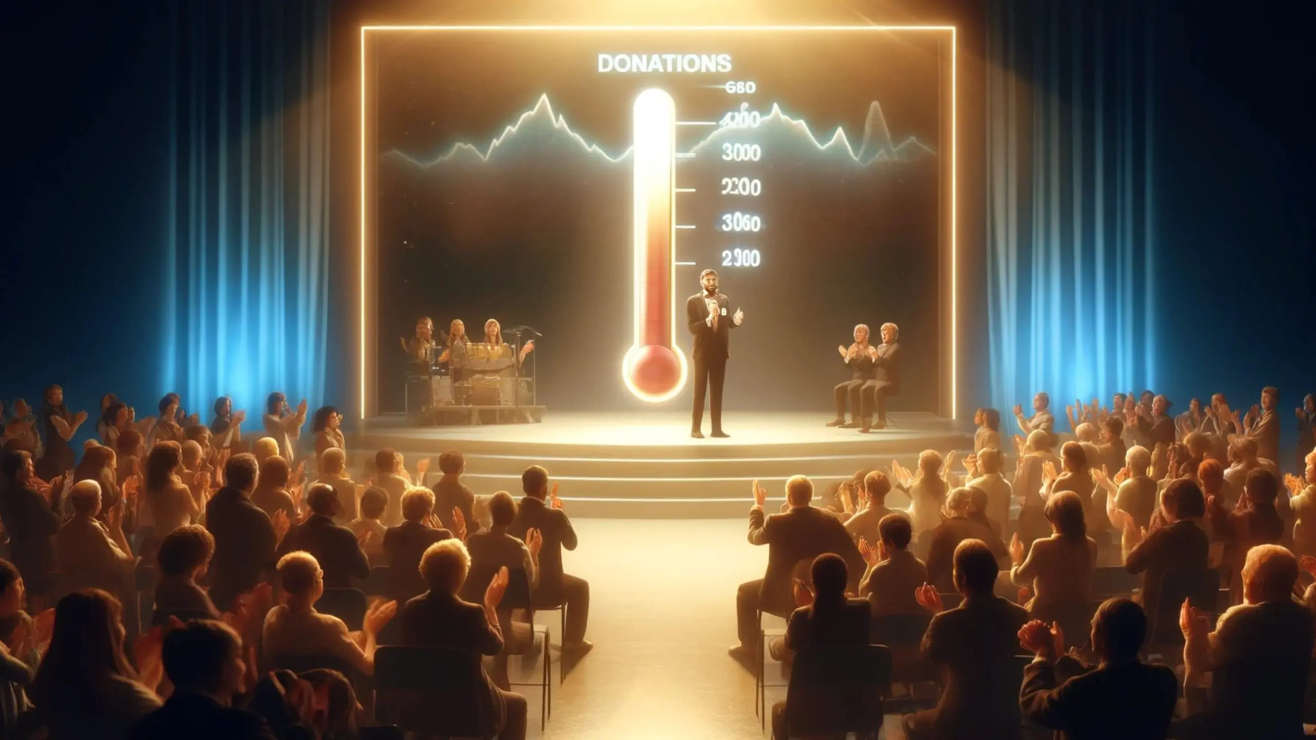
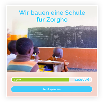
3. Also, utilize widgets to raise awareness about your fundraising campaigns and projects. These are interactive windows that can be effectively linked to a donation form. They are visually appealing and come in various forms — for example, with an integrated donation thermometer. With fundraising software like FundraisingBox, you can quickly create and integrate such widgets on your pages.
Simple and effective: a widget with a donation baromometer.
4. When it comes to fundraising software: Of course, you can program a donation form yourself. However, this can be quite time-consuming and, especially since GDPR, not entirely straightforward. With good fundraising software, you have a user-friendly application that makes configuring, customizing, and embedding into your website a breeze. Ideally, you should link your forms and fundraising campaigns directly to the included CRM, allowing you to automatically and clearly manage and utilize donation and donor data. This way, automated thank-you emails and many other useful features are also available. You can get to know FundraisingBox CRM and our donation forms in one of our webinars without any obligation: [Link to Webinars].
5. Lastly, a reminder: Use tracking tools like Google Analytics to continually evaluate and improve your donation page. There are now many great and easy-to-use tools that can help you with this. In this article, we have provided an introduction to tracking donation forms and digital fundraising campaigns. SEO (Search Engine Optimization) is also helpful for ensuring your website is more discoverable online. Optimizing images for SEO can also drive a lot of traffic to your website or campaign pages.
So much for our collected knowledge on improving the conversion rate of donation pages. What experiences have you had with your site? Are there any tips and tricks that we haven’t listed here?


 Care knows the power of positive images and automatically suggests high contributions.
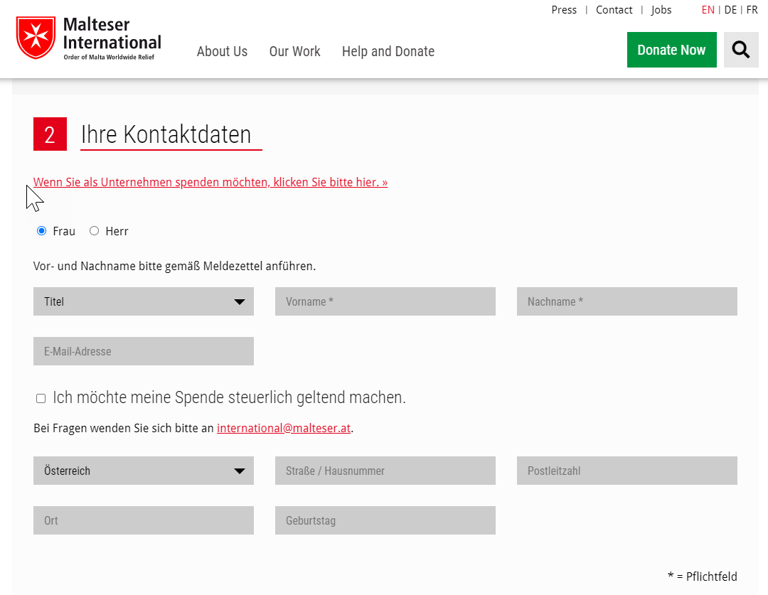
 …even in the mobile version.
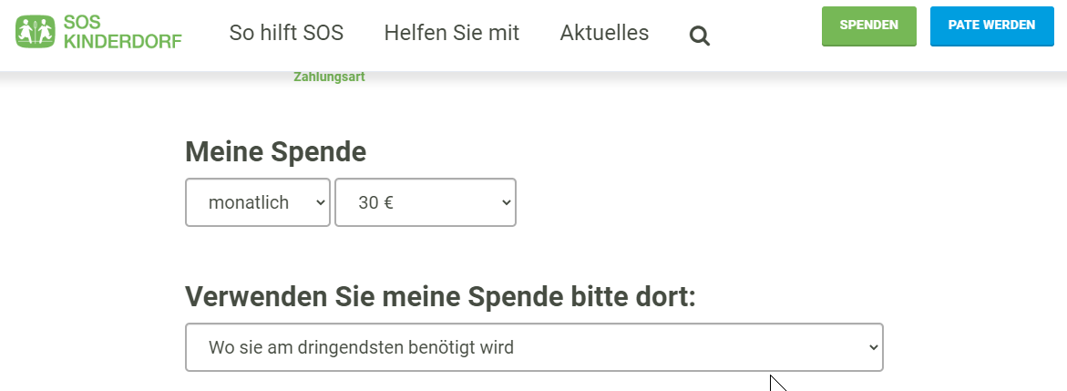 SOS Kinderdorf has a dedicated sponsorship form for regular donations. A monthly amount of €30 is pre-filled automatically.
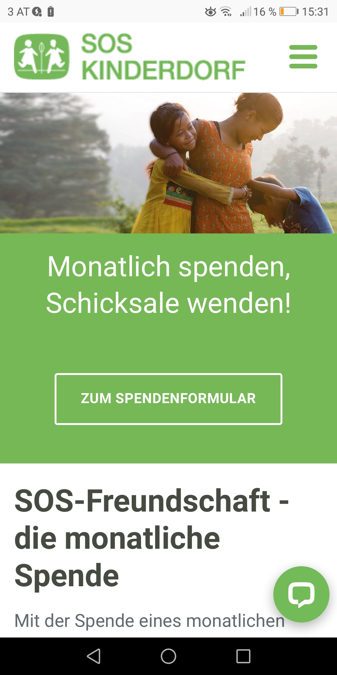 It also looks great on mobile devices!
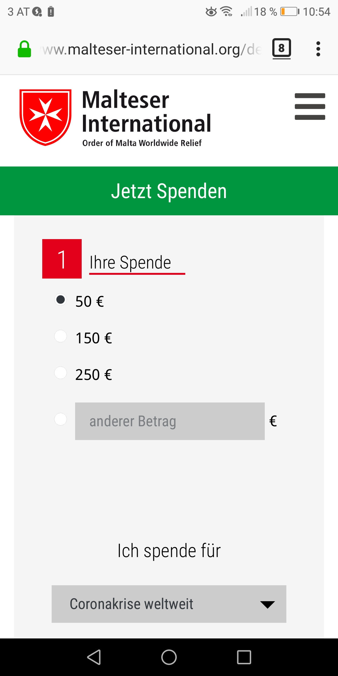
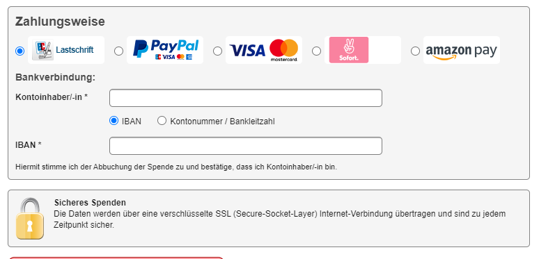 Aktion Deutschland Hilft offers all common payment methods.

 So much for our collected knowledge on improving the conversion rate of donation pages. What experiences have you had with your site? Are there any tips and tricks that we haven’t listed here?